Branded Packaging Design
Feb 7, 2024
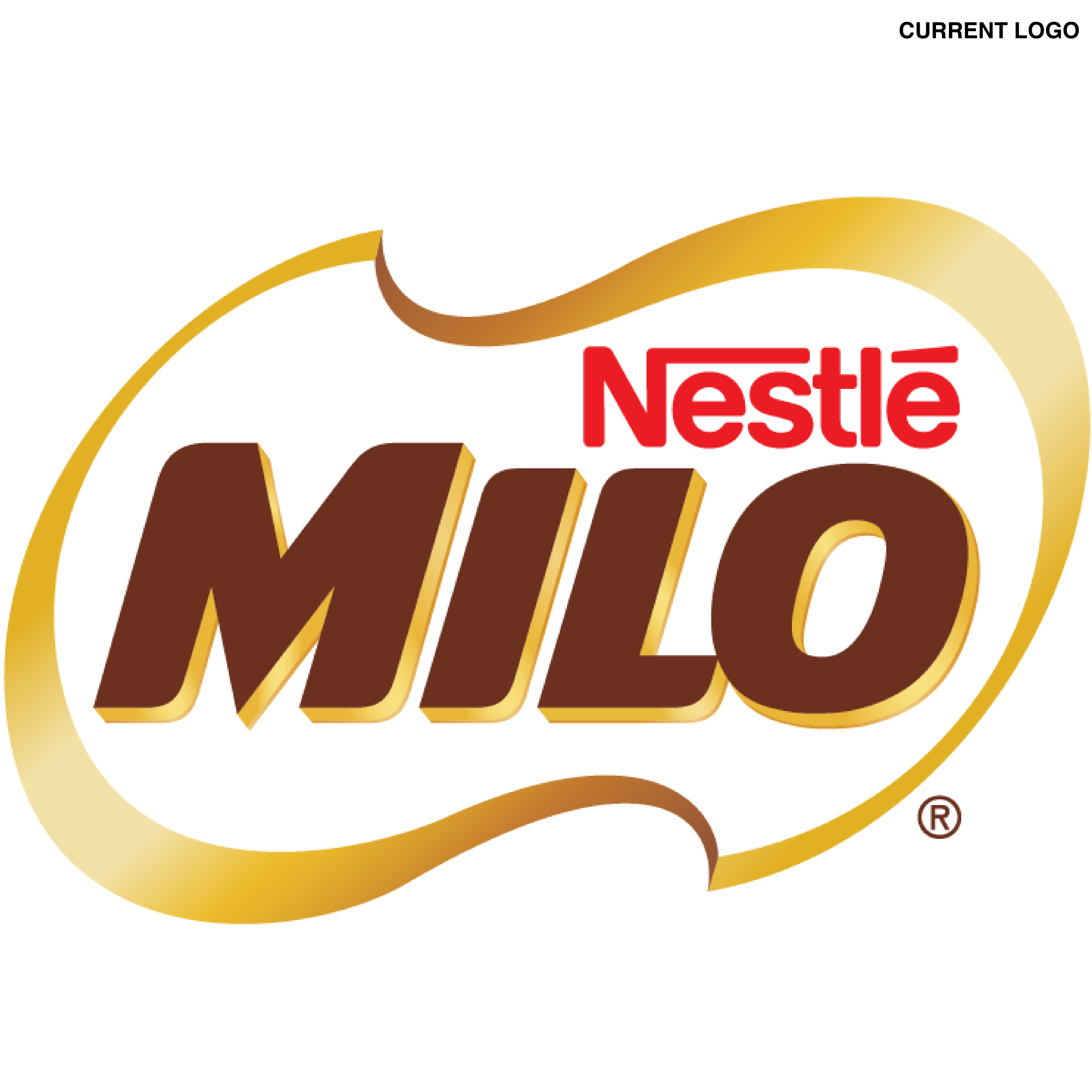
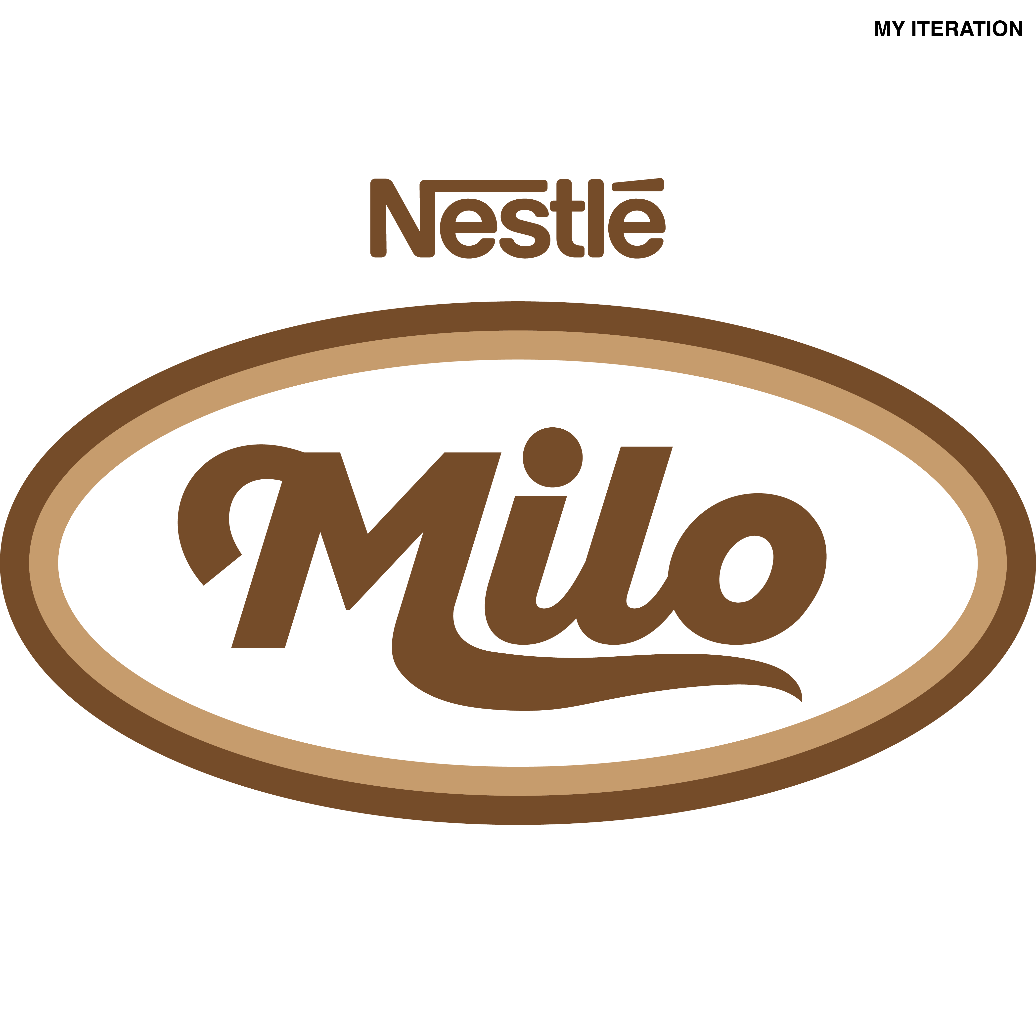
Milo Rebrand
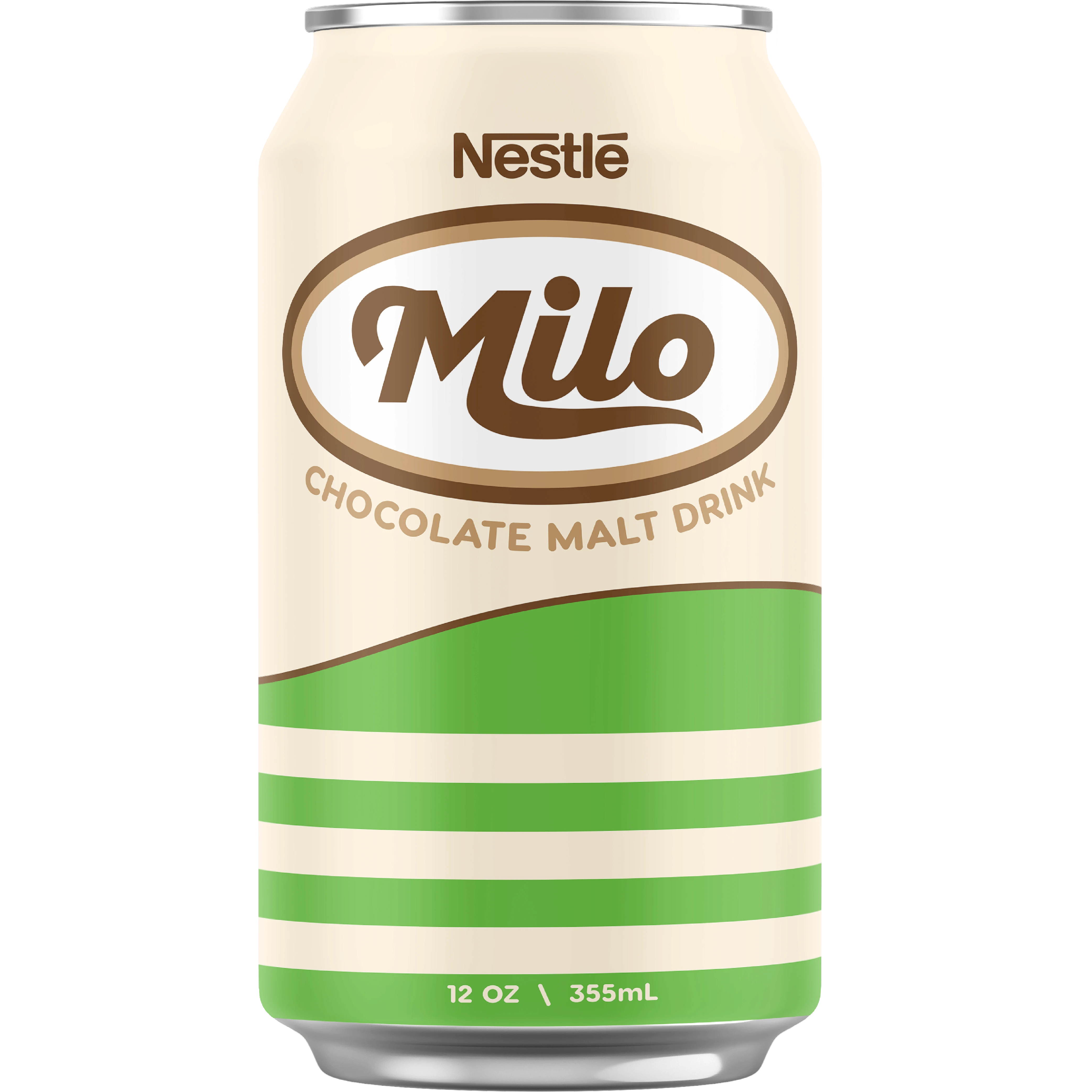
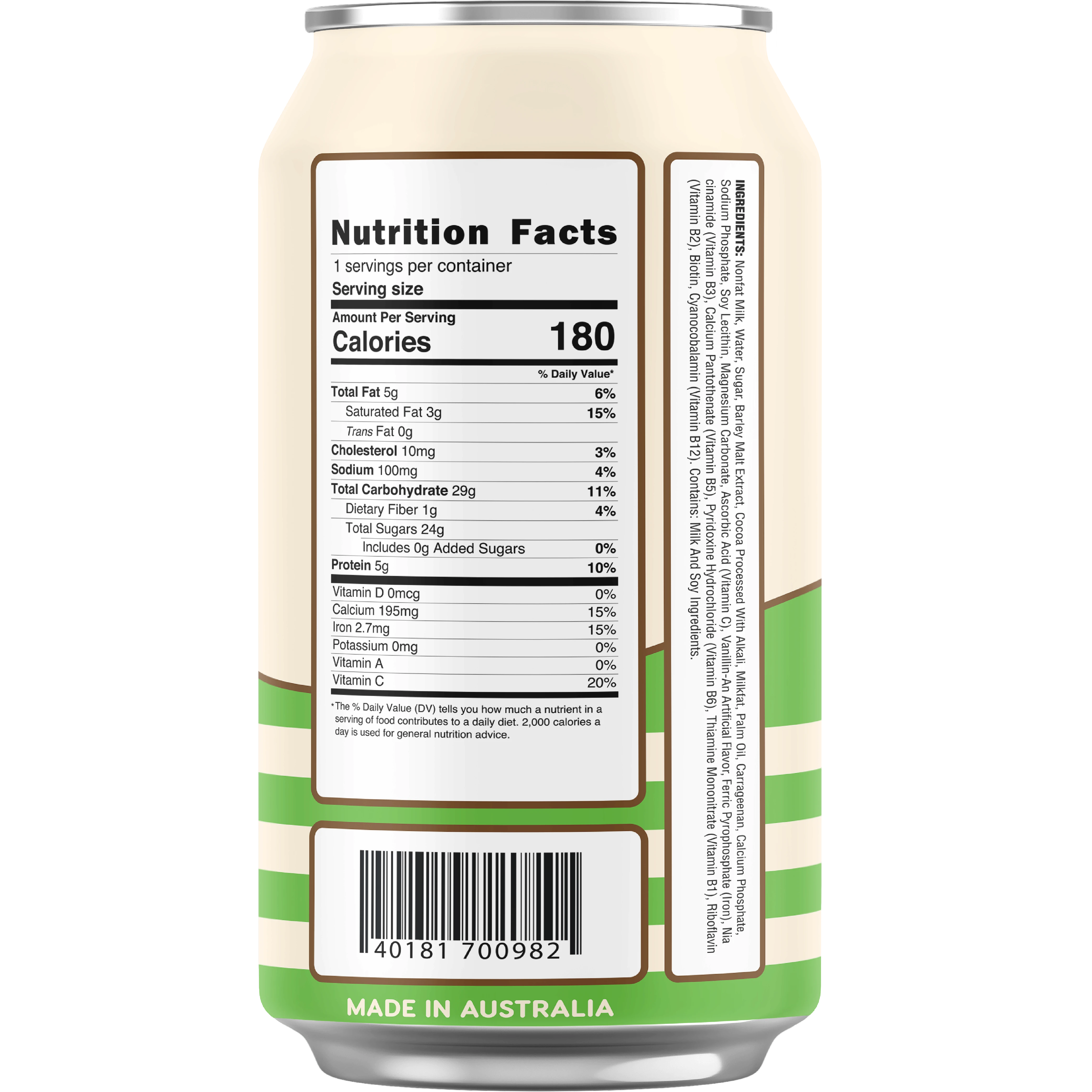
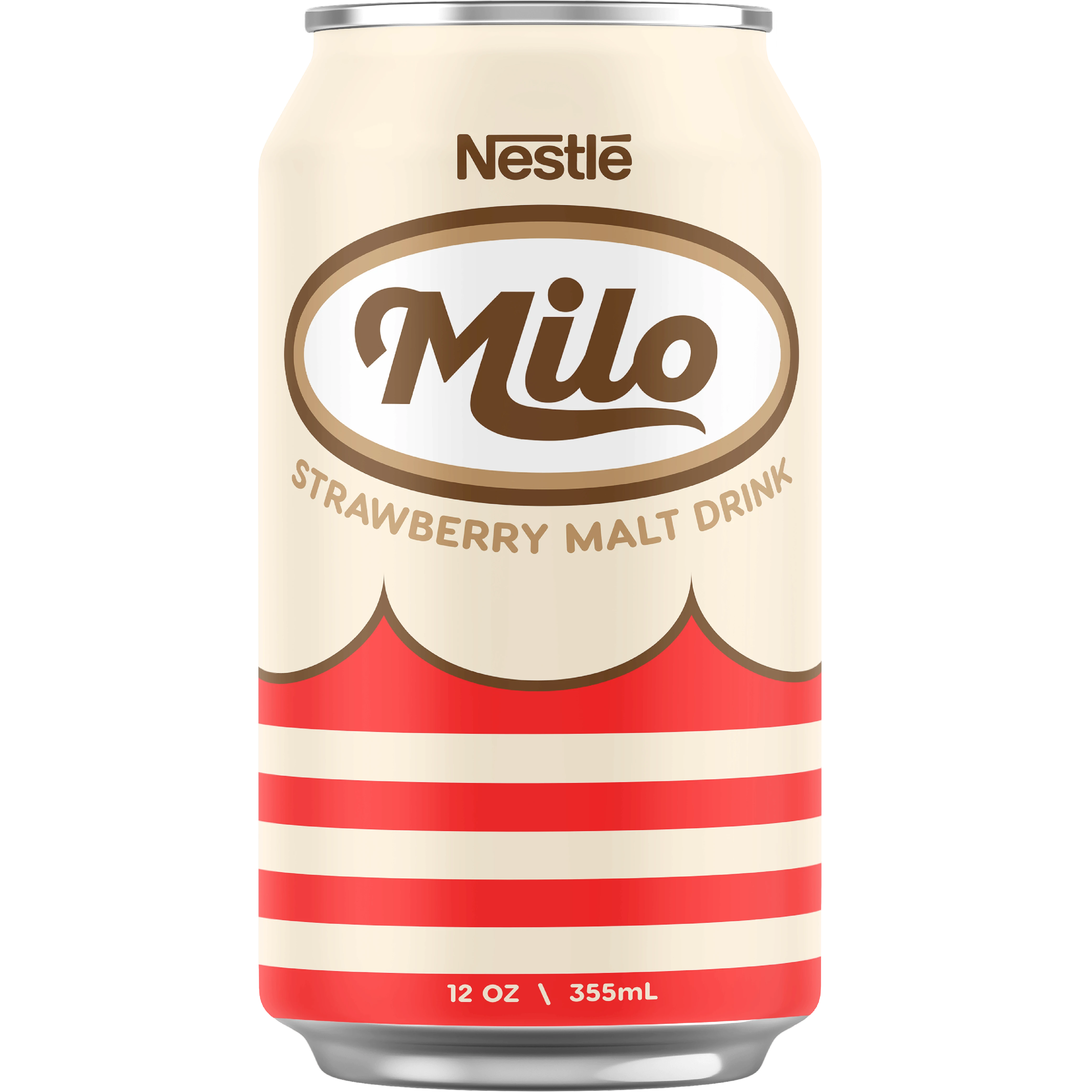
This was a student design project where I was tasked with rebranding an established beverage company’s logo and overall aesthetic to align with a specific decade. I was required to create a beverage label design, Instagram advertisement posts, and a collective poster showcasing the changes.
Vision & Approach
For this retro beverage rebrand, I chose Nestlé’s chocolate malt drink, Milo, drawing on a 70s design aesthetic. My inspiration came from studying popular beverage brands like Pepsi, Sprite, Coca-Cola, and 7Up, as well as Japanese Showa-era product design. I created all the designs using Adobe Illustrator and used Adobe Photoshop for the physical can mockups.
Strawberry Milo?
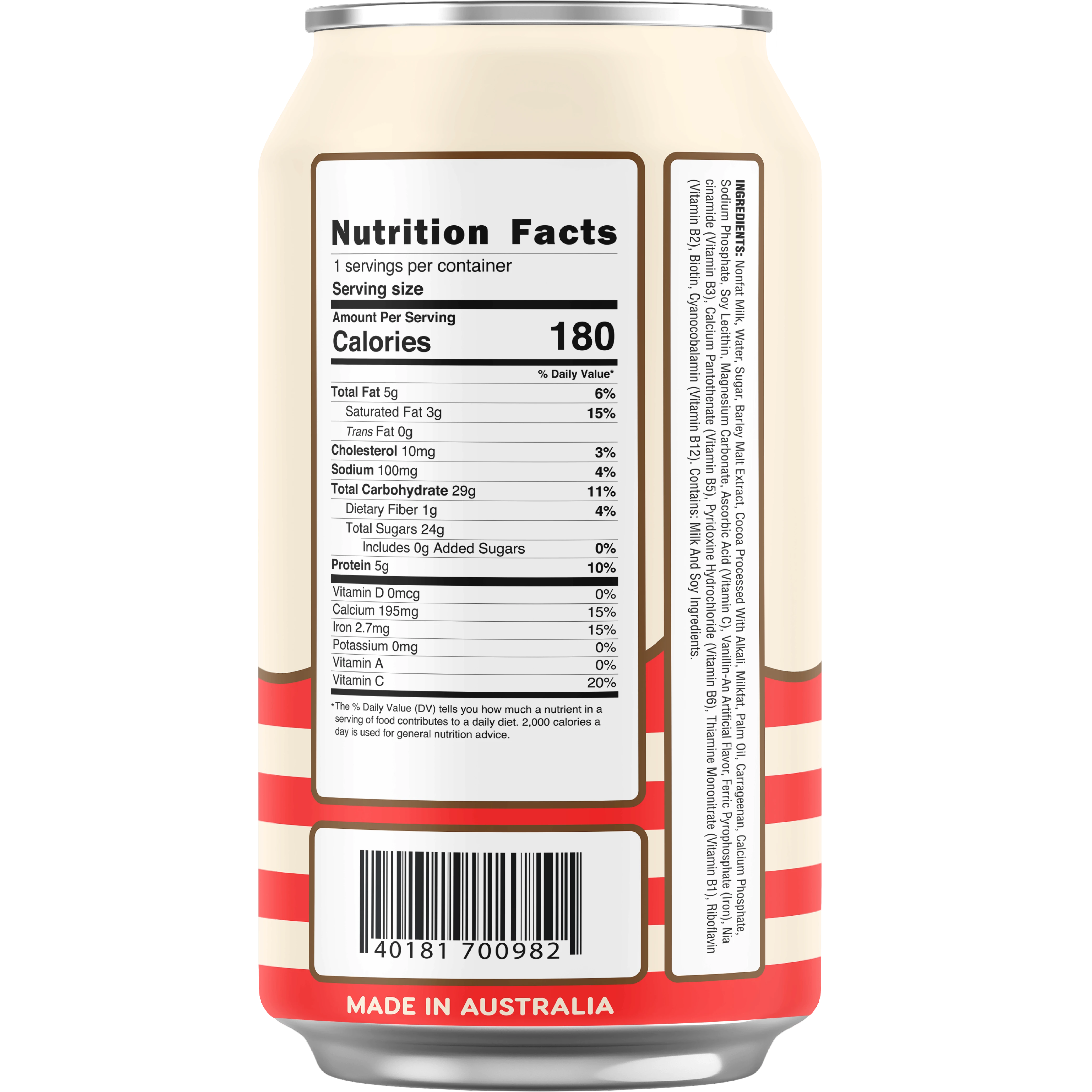
Alongside the original Milo drink, I created a hypothetical strawberry malt flavor for two reasons: first, to explore a new market, and second, because why not ¯\_(ツ)_/¯. I kept the same layout and design to maintain brand consistency and avoid confusing consumers. The only changes I made were to the colour and the 'wave' design, which I adjusted to subtly resemble strawberry leaves for added detail.
Instagram Posts
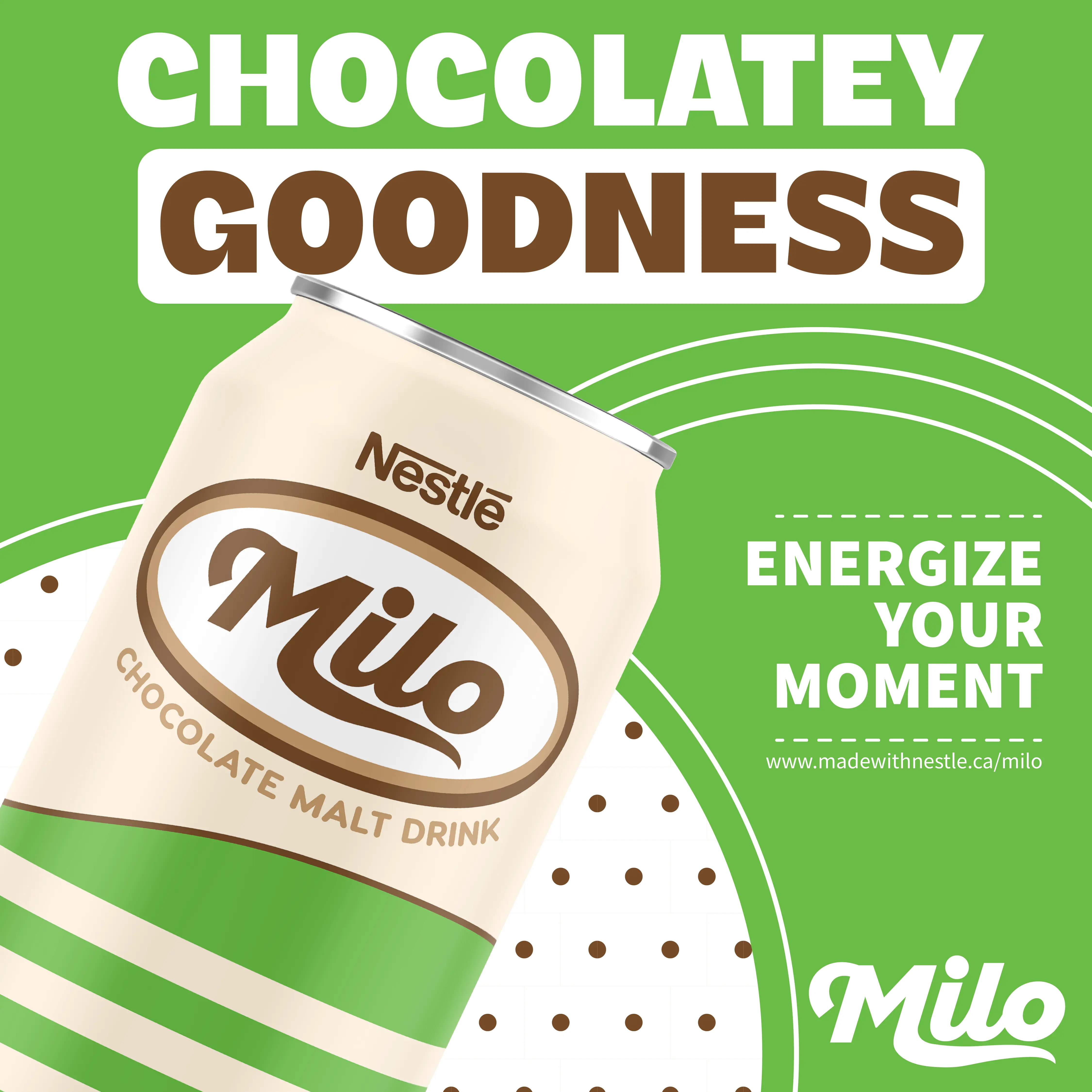
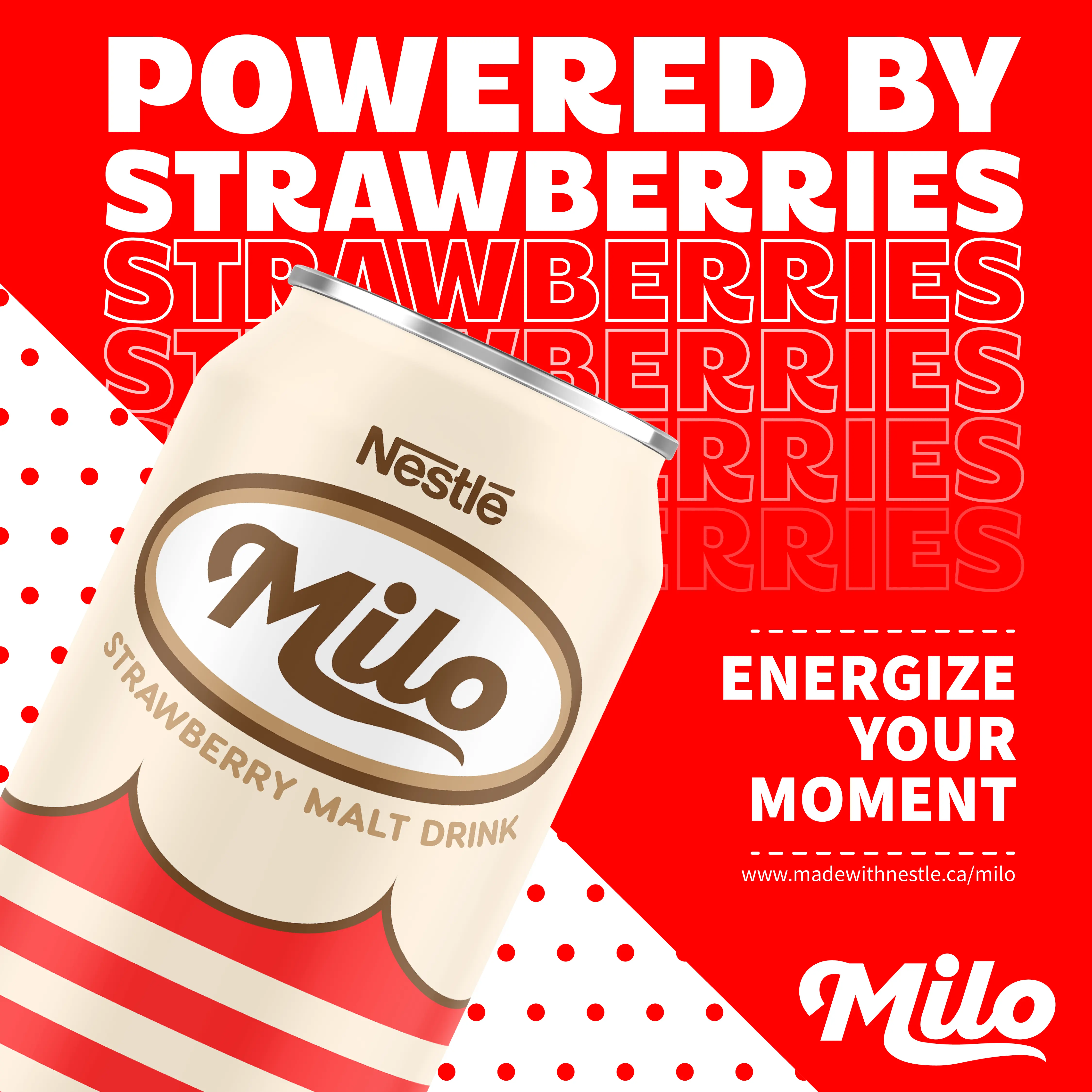
For these Instagram posts, I experimented with the layout to create a visual hierarchy, guiding viewers' attention to key elements. I used bold, stylized heading text to capture attention and convey a vibrant feel, emphasizing the brand's energy drink aspect. I also included a call to action directing viewers to the Milo website.
Similar to the label designs, I aimed to reflect the subtle changes that tie the brand together while promoting different products with a cohesive feel.
Rebrand Showcase Poster
Tying everything together, here is the poster that showcases the inspiration behind the rebrand, a brief history of Milo, and the campaign vision. To reflect the 70s and Showa-era product design, I decided to include a person in the design to add more emotion and a sense of connection. This choice enhances the nostalgic feel and engages viewers on a personal level.
To further evoke a retro aesthetic, I added texture to the poster, giving it a vintage look that aligns with the overall theme. With the combination of these elements it creates a compelling visual narrative.

